The analytics dashboard is the single page where you can see how busy your restaurant has been, how busy it is forecasted to be, and where your bookings are coming from. This article runs through the layout — the date controls, the two tabs, every summary card, and every chart — so you know what each number is and where it comes from. For how to read what you see, jump to Reading the reports.
Where to find it
- Sign in to manage.makearezzy.com and pick your business.
- Open Analytics under Marketing & Website in the left-hand menu.
Date range and interval
The filter bar at the top sets what every card and chart on the page shows:
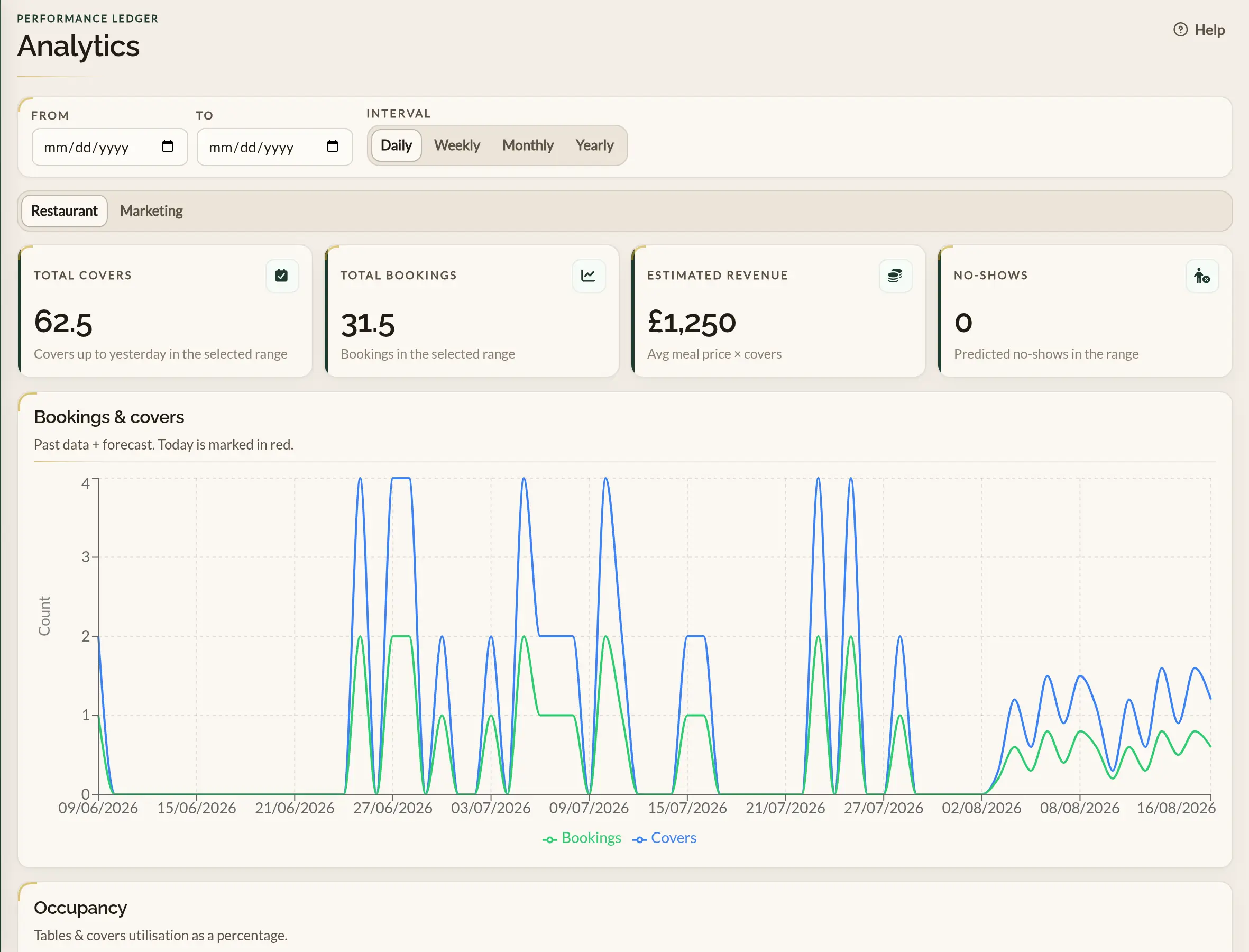
- From and To — the date range. Pick any window — the last 7 days, this month, the last quarter, last year. The charts and summary cards update as you change either field.
- Interval — how the line charts bucket the data: Daily, Weekly, Monthly, or Yearly. Pick the one that matches the question you are asking. Daily for last week, weekly or monthly for last year.
Restaurant and Marketing tabs
A toggle below the date filters switches between two views:
- Restaurant — what is happening inside the restaurant. Covers, bookings, occupancy, revenue, no-shows, and AI-generated insights for the days ahead.
- Marketing — where your bookings come from. Bookings by channel and campaign, and how website visits progress to a booking.
The Restaurant tab at a glance
Summary cards
- Total covers — the total number of guests across all bookings in the selected range, counted up to yesterday. Future dates are excluded from this card so it stays grounded in what has actually happened.
- Total bookings — the number of bookings in the selected range. Includes today and any future dates that fall inside the window.
- Estimated revenue — your average price per head, multiplied by the total covers up to yesterday. Set your average under Business details → Basic so this card reflects what you actually charge.
- No-shows — a predicted no-show count for the range, based on past behaviour rather than confirmed marks.
Charts
- Bookings & covers — daily counts of bookings and forecast covers across the date range. Past dates are actuals; future dates are forecast. Today is marked with a red vertical line so you can tell the two apart at a glance.
- Occupancy — how full the restaurant is, by both covers (seats taken) and tables (tables seated). Shown as a percentage. Helpful for spotting nights that look busy on the booking count but actually have plenty of empty seats — and the other way around.
AI-generated insights
A panel at the bottom of the Restaurant tab summarises the days ahead in plain English, with a per-date card listing the predicted booking count and a short note about what is driving it. Treat this as a quick-glance heads-up rather than a hard forecast — see Reading the reports for how to act on it.
The Marketing tab at a glance
Summary cards
- Bookings — every booking made in the selected range, counted by the day it was made rather than the day of the visit.
- Covers — the total guests across those bookings.
- Paid share — the percentage of bookings that came from paid search or paid social adverts.
- No-shows — confirmed no-shows among the bookings in the range.
Bookings by channel
A line chart of bookings over time, split by how each booking arrived — paid search, paid social, organic search, social, email, referral, direct, or an offline source such as phone or walk-in.
Bookings by source
A table of every channel with its bookings, covers, cancellations and no-shows. Where bookings arrived from a tagged advertising campaign, the channel breaks down further into a row per campaign, so you can see exactly which campaign produced which bookings.
Booking funnel by channel
For each online channel, how many visitors viewed your booking page, how many started a booking, and how many completed one. A channel that brings plenty of visitors but few bookings is the clearest signal to look at what those visitors find when they land.
Days on this tab follow your timezone preference, the same as the rest of the app — see Your profile and preferences.
Where to go next
- Reading the reports — how to interpret each chart and what to do with what you learn.
- Business details — set your average price per head so the revenue card is meaningful.
- Customising the widget — a clean, on-brand widget is one of the simplest levers to pull on conversion rate.