The Explore configurator lets you match your Explore page on Make a Rezzy to your restaurant's brand — primary colour, font, background image, and the styling of every section on the page. You can set each control by hand, or let AI design the page from your website. This article walks through every control, the draft and publish flow, and where to look for things that live elsewhere. For the difference between your Explore page and your detail page, see What is the Explore page?
Opening the configurator
- Sign in to manage.makearezzy.com and pick your business.
- Open Edit Explore Page under Marketing & Website in the left-hand menu.
The configurator has a live preview on the left and the controls on the right. Every change you make is reflected immediately in the preview — there is no "Apply" button — but nothing is live until you publish.
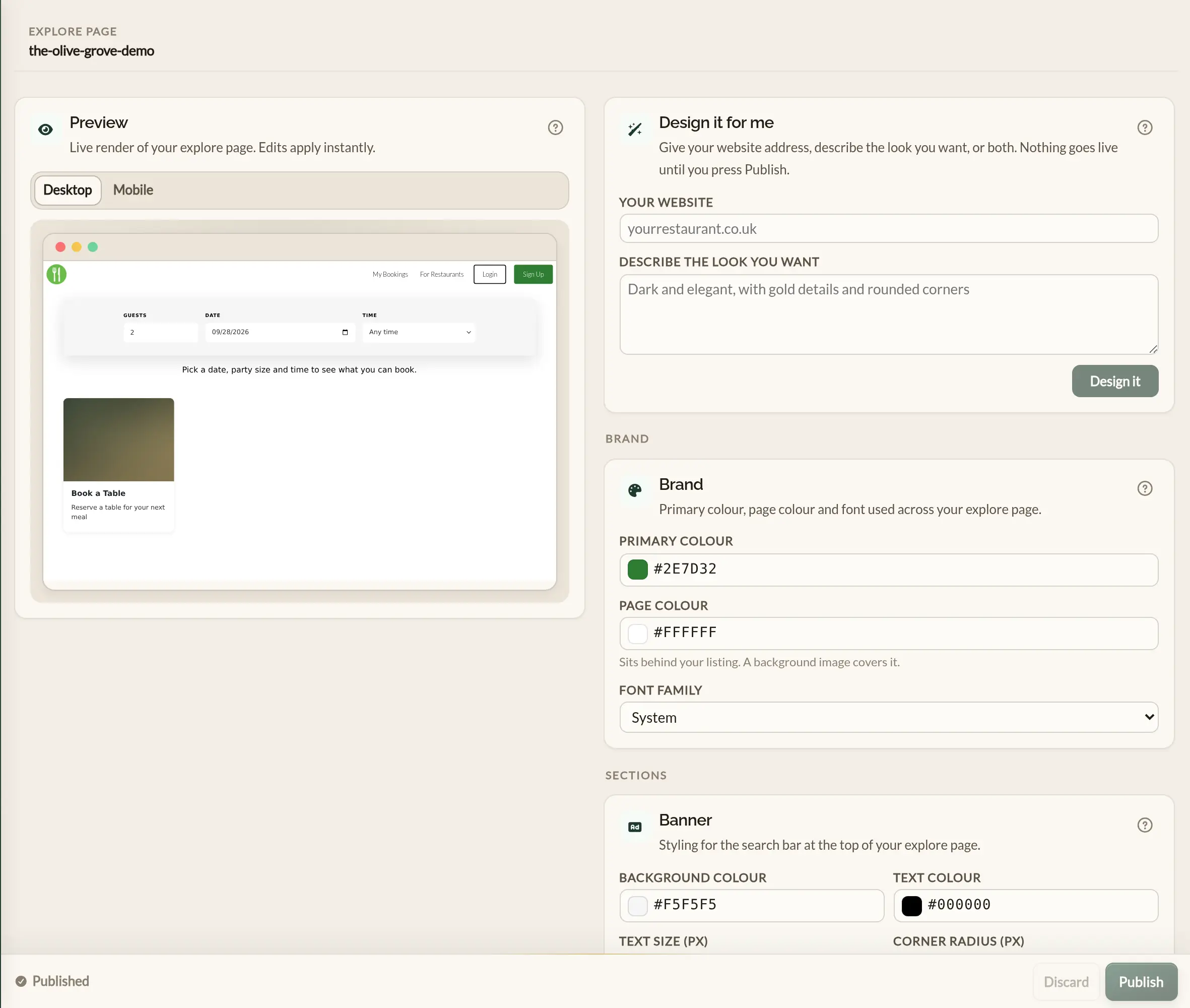
Design it for me
Design it for me uses AI to style your Explore page for you, so you do not have to work through every control by hand. Give it your restaurant's website, describe the look you want, or both.
-
In Your website, type your website address —
yourrestaurant.co.ukis enough. - In Describe the look you want, say what you are after in your own words, for example "warm and rustic, terracotta and cream". You can leave this blank and work from your website alone.
- Click Design it. It takes a few seconds.
From your website it picks up your brand colour, the colour of your pages, your text colour and the closest matching font. The controls are filled in for you and the preview updates, so you can see the result straight away.
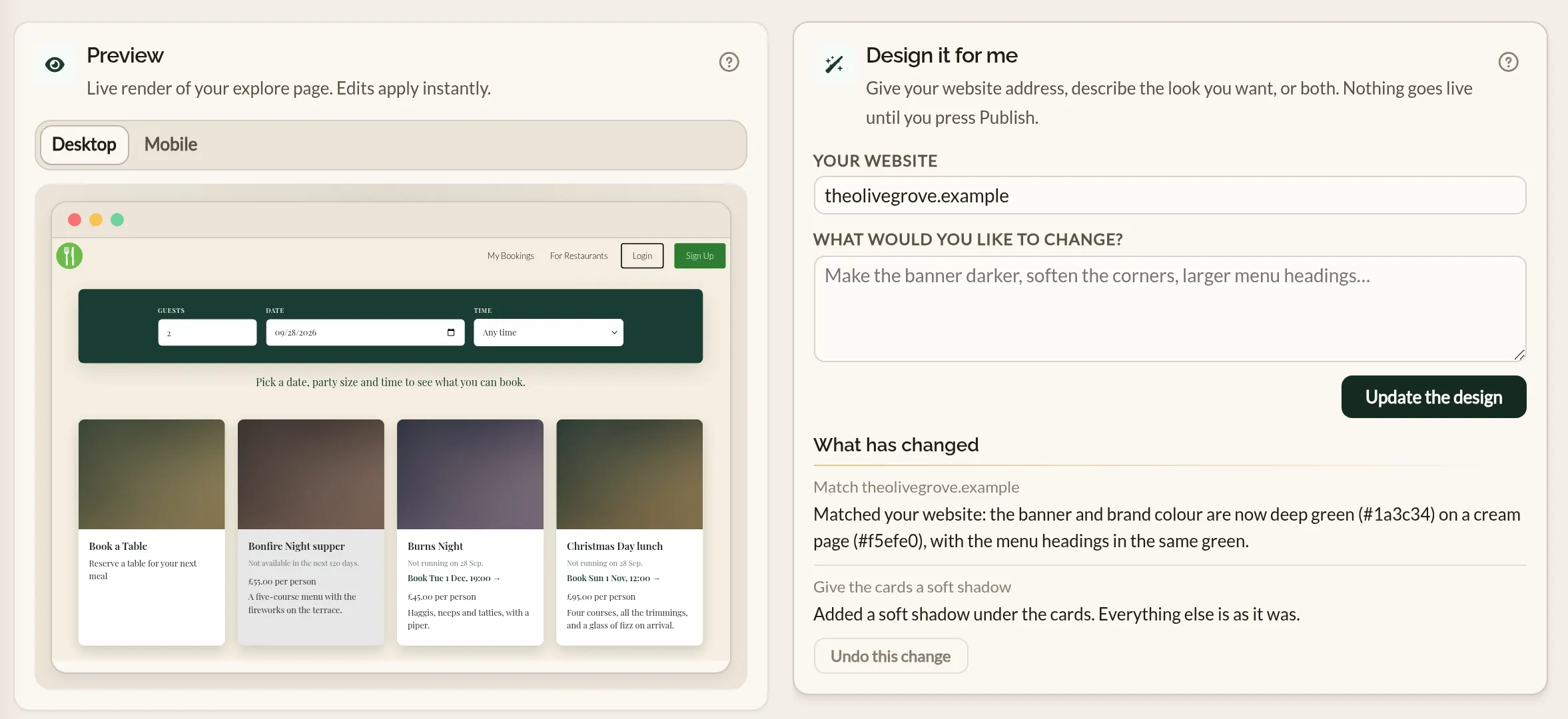
Asking for changes
Once it has made a design, the description box becomes What would you like to change? Ask for an adjustment in plain words — "make the banner darker", "give the cards a soft shadow", "larger menu headings" — and click Update the design. It changes what you asked for and leaves the rest as it is, including anything you have edited by hand in between.
Each change is listed under What has changed, with a short note of what was done. If you do not like the latest one, click Undo this change to put things back as they were. Undo is there until you edit a control yourself.
What it changes and what it leaves alone
- It sets the primary colour, page colour and font, and the colours, text sizes and corner rounding of the banner, the instructions and the menu cards.
- Where the controls cannot produce the look — a shadow, a border, a hover effect, letter spacing, the corners of the event cards — it writes a little CSS into Advanced CSS for you.
- It keeps the Confirm booking button readable. When it changes your primary colour, it sets the button's text to light or dark, whichever reads better on that colour.
- It does not pick a page colour so dark that the links at the top of the page become hard to read. If you want a dark page, set Page colour yourself under Brand.
- It does not choose, change or remove your background image or your Reserve a table image, and it does not touch your menus, events or any other content.
- It chooses from the same fonts as the Brand section, so expect a close match to your website rather than an exact copy.
Brand
The three settings that shape the whole page:
- Primary colour — your restaurant's main brand colour. Used for accents and highlights throughout the listing.
- Page colour — the colour of the page behind your listing. White until you change it. A background image, if you have set one, covers it. The links at the top of the page sit on this colour in black text, so keep it light enough to read them.
- Font family — System (uses whatever the visiting browser already has), Inter, Lato, Playfair Display, Roboto, or Montserrat. Pick something close to the font on your own website so the two feel like the same restaurant.
Banner
The banner is the search bar that sits at the top of your listing — where guests pick a date, party size, and time:
- Background colour and text colour — keep the contrast strong so the inputs read well over your background image.
- Text size (px) — The size of the text in the banner.
- Corner radius (px) — Controls the roundedness of the banner's corners. 0 for square edges, higher for more rounded.
Instructions
A short prompt sits below the banner asking the guest to pick a date, party size, and time. The configurator lets you set its text colour and text size (px). Use a colour that stands out against the background so the prompt is easy to spot.
Menus
The menu section near the bottom of the listing shows your menu cards (each one a menu PDF or image you have uploaded under Business details). The configurator styles the cards:
- Background colour and Background hover colour — the card's background colour at rest and when a guest hovers over it.
- Heading colour and Heading size (px) — the menu's name.
- Body colour and Body size (px) — the menu's description.
Background image
The background image sits behind all your content. Scroll down to Background image, then either pick an image you have already uploaded or upload a new one.
Alternatively, if you want to remove the background image, click on Clear selection.
Wide, dark photos of your dining room or food work well — the text in the banner and the instructions has to be readable against it. Avoid busy patterns or text-on-image graphics.
Reserve a table image
Sits on the "Book a table" card on the listing. A simple, inviting photo — a place setting, the bar, a signature dish — works well. Pick or upload it the same way as the background image.
Events
Every published event appears as a card next to the "Book a table" card, whatever date and time the guest has picked. Each card shows the event's cover image, name, short description, and price — all of which come from the event itself, not from the configurator. If the guest cannot book the event at their chosen date and time, the card says why and, where there is a later slot, offers to take them to it.
Event cards share their layout with the Reserve a table card, and pick up your primary colour and font from the Brand section. There is no separate event styling control — to change how event cards look, change the event's cover image and copy on the Events page, or adjust the Brand colour and font here.
Advanced CSS
Below the structured controls is an Advanced CSS panel that accepts raw CSS. It is a power-user feature — most operators will never need it. Reach for it when:
- You need a specific shadow, gradient, or hover state that the built-in controls do not expose.
- Your designer has given you a stylesheet you want to apply verbatim.
Targeting parts of the page
Each part of the listing has its own name, which you can use
after #explore-main-container:
[data-mar-part="banner"]— the search bar at the top.-
[data-mar-part="label"]— the text above each field, in the banner and in the booking form. -
[data-mar-part="field"]— the inputs and drop-downs, in the banner and in the booking form. -
[data-mar-part="instructions"]— the prompt below the banner. -
[data-mar-part="card"]— the "Book a table" card and each event card. [data-mar-part="menu-card"]— each menu card.-
[data-mar-part="booking-form"]— the form that opens when a guest picks a card. -
[data-mar-part="button"]— the Confirm booking button.
#explore-main-container [data-mar-part="card"] {
  box-shadow: 0 6px 18px rgba(0, 0, 0, 0.18);
}

#explore-main-container [data-mar-part="banner"] [data-mar-part="label"] {
  letter-spacing: 0.12em;
}
To reach only the banner's labels or fields, put the banner first, as in the second rule. The same works for the booking form.
CSS written by Design it for me
When Design it for me writes CSS, it keeps it between two marker lines:
/* design-assist:start */
...
/* design-assist:end */
Anything between the markers may be rewritten the next time you ask for a design. Put your own CSS above or below them and it will be left alone. It never writes CSS for something a control already sets, so the controls keep working after a design.
Draft, preview, publish
The bar at the bottom of the configurator tracks where your edits are:
- Saving draft… — appears while a recent edit is being autosaved to your draft. Edits never disappear if you close the tab mid-way.
- Draft saved · not yet published — your draft has more recent edits than the live listing. The preview shows the draft, but the listing your guests see is unchanged.
- Published — your draft matches what is live. No outstanding edits.
Two actions on the bar:
- Publish — promotes your draft to the live listing. Guests see the change within seconds.
- Discard — throws away every edit since the last publish, and reverts the configurator to the live version.
Mobile-friendly design
More and more guests are browsing and booking on their phones, so the Explore page allows you to preview your listing in both a desktop and mobile layout. The configurator's live preview defaults to desktop, but you can toggle to mobile view at any time to see how your edits look on a smaller screen.
It is important to check your listing in both views as you edit, since the mobile layout stacks content vertically and may reveal issues with spacing, font sizes, or image cropping that are not apparent in the desktop preview. The configurator's responsive design ensures that your listing looks great on any device, but a quick check in mobile view can help you catch any adjustments needed to make the best impression on diners browsing on their phones.
Once you do publish, always check the live listing on a phone as well as a desktop browser to make sure everything looks right. If you spot an issue that only shows on mobile, the mobile preview is the place to test your fix before publishing again.
Where to go next
- What is the Explore page? — what the listing does and how diners reach it.
- Business details — for the content on the listing (name, description, photos, menus, opening hours).
- Creating an event — events that appear as cards on the Explore page.
- Customising the widget — the configurator for the booking entry point on your own website.