The analytics dashboard surfaces numbers; this article is about turning those numbers into operating decisions. It runs through each chart on the page, what is worth paying attention to, and what the common patterns usually mean. For a tour of the layout itself, start with Your analytics dashboard.
Past data, forecasts, and how to tell them apart
Two charts on the Restaurant tab — Bookings & covers and Occupancy — show past and future on the same line. Today is marked with a red vertical rule. Everything to the left of it is what actually happened; everything to the right is a forecast based on your recent pattern.
A few practical implications:
- Trust the past more than the future. The forecast is best read as "what to expect if nothing changes" — not as a guarantee.
- Watch the slope of the forecast, not the absolute number. A forecast that is gently rising or falling tells you more than the exact predicted figure on any one day.
- Compare last week to this week. If you ran an offer or had a one-off event, switch the date range to that week and the week after to see what carried over.
Reading the summary cards
Total covers vs total bookings
Bookings is the number of parties; covers is the number of guests. The ratio tells you the average party size for the range. If it falls noticeably below your usual, your bookings are skewing towards couples and pairs — useful to know before planning a tasting menu that needs a group of four to make sense.
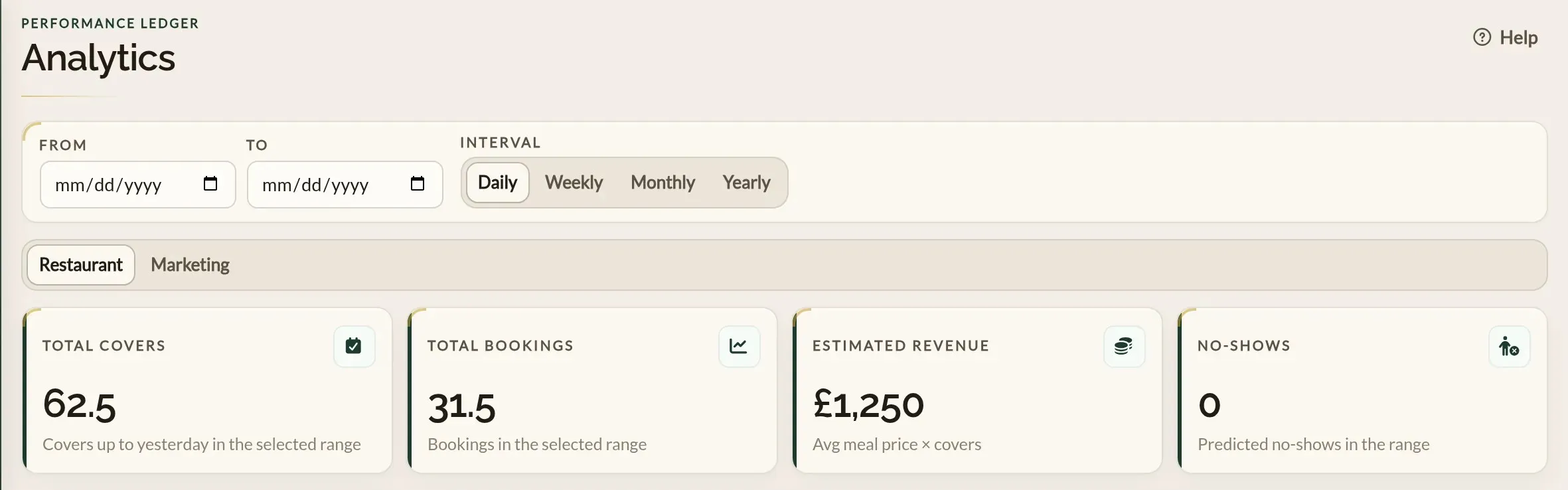
Total covers stops at yesterday on purpose — so the figure stays a record of what has actually happened. Total bookings includes today and any confirmed bookings in the future, since those are bookings on the books rather than predictions.
Estimated revenue
Revenue is your average price per head, multiplied by total covers up to yesterday. There is no calculation involving real payments — it is a rough sizing of how busy the kitchen has been, in pounds, so it can sit next to your covers and bookings numbers.
To make it meaningful, set your average price per head under Business details → Basic. Until you do, the dashboard uses a placeholder so the card has something to show — but the figure will be off until your real average is in.
No-shows
The no-show card is a prediction based on past behaviour, not a count of bookings you have actually marked as no-shows. Use it to plan headcount and prep rather than to follow up with specific guests.
For the day-by-day reality, mark no-shows in the Calendar after service and the predictions will improve over time.
Reading the occupancy chart
Occupancy is plotted as two lines — covers and tables:
- Covers occupancy is the share of seats taken. The headline measure of how full you are.
- Tables occupancy is the share of tables seated, regardless of party size.
When the two lines move together you are well-matched — your table layout fits the party sizes you actually take. When tables occupancy is meaningfully higher than covers occupancy, you are seating small parties on large tables and leaving covers on the table. Reach for the floor plan editor if that pattern is consistent.
Reading the AI-generated insights
The insights panel summarises the days ahead, with a per-date card listing the predicted bookings and a short note about the underlying pattern. It is built from the same forecast that drives the Bookings & covers chart, plus the seasonality the model has learned from your past data.
A few rules of thumb:
- Use it as a heads-up, not a brief. It points you at the days worth paying attention to; the decision about what to do is yours.
- It improves as your data grows. A restaurant with three months of bookings will get more useful summaries than one with three weeks.
- Cross-check against the past. If the model predicts a slow Tuesday, scroll back through past Tuesdays in the same range to see if that is normal or a one-off.
Reading the Marketing tab
Bookings by channel
The channel split tells you which of your marketing is actually producing bookings, not just visits. A few patterns to watch for:
- Mostly direct. Loyal guests coming straight to you. A good sign — but growth usually comes from the search, social and paid channels around it.
- Organic search strong, paid absent. People find you when they look for you. Paid campaigns are how you reach the ones who are not looking yet.
- A paid campaign with bookings against it. Divide what you spent on the campaign by its bookings for your cost per booking, and weigh that against the value of a table. The campaign rows in the table make this per-campaign, not just per-channel.
- No-shows clustering in one channel. Worth knowing before you spend more on it — some channels bring guests who book more casually than others.
The booking funnel
The funnel shows, per channel, how visits become bookings: visited, started, booked. Read it by looking for the big drop:
- Many visits, few starts. People land and leave. Look at what they see first — photos, opening copy, whether the times they want are visible quickly.
- Many starts, few bookings. Something in the form is stopping them — too few available times, or a rule that is not explained. Review your availability and the widget's wording.
Putting it together
A monthly habit that catches most things:
- Set the date range to the last month and the interval to daily.
- On the Restaurant tab, check covers occupancy. Are there whole days or services consistently below 60–70%? That is where pacing changes, an offer, or an event would make the biggest difference.
- Switch to the Marketing tab. If one channel's funnel drops sharply between visits and bookings, walk through your widget yourself — see the booking flow as a guest does.
- Look at the bookings-by-source table. The biggest channel tells you what is working; a paid campaign's bookings tell you whether the spend is paying for itself.
- Switch the interval to weekly and pull the date range back to the last quarter. The longer view picks up trends that day-to-day noise hides.
Where to go next
- Your analytics dashboard — the layout, every card, every chart.
- Business details — set your average price per head so the revenue card is meaningful.
- Customising the widget — the simplest lever for lifting conversion rate.