Out of the box, the reservation widget looks clean but generic — a green button on a white background. The configurator lets you match it to your restaurant's brand: colours, fonts, spacing, wording, even raw CSS if you need it. You can also have it designed for you with AI, from your own website or a short description. This article runs through every control, what it changes, and when to reach for it.
Opening the configurator
- Sign in to manage.makearezzy.com and pick your business.
- Open Website Widget from the left-hand menu.
- Click the widget you want to edit.
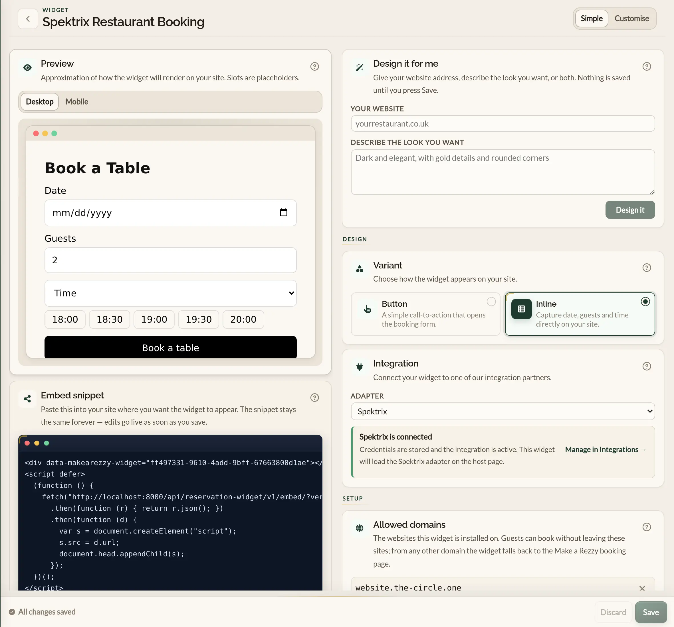
The configurator has a live preview on the left and the controls on the right. Edits update the preview the moment you make them. Nothing is published until you save — see "Saving your edits" below.
Simple and Customise modes
A toggle in the top bar switches between two views of the controls:
- Simple — the bare minimum. Pick a variant (Button or Inline) and an integration. Everything else uses sensible defaults. Good for getting a widget live in two minutes.
- Customise — everything else. Brand colours, layout, button text, inline form options, customer-facing copy, and advanced CSS.
Switching between modes does not lose any settings — Customise just shows more controls. Most operators flip to Customise once and stay there.
Design it for me sits at the top of the controls in both modes.
Design it for me
Design it for me uses AI to style the widget for you, so you do not have to work through every control by hand. Give it your restaurant's website, describe the look you want, or both.
-
In Your website, type your website address —
yourrestaurant.co.ukis enough. - In Describe the look you want, say what you are after in your own words, for example "dark and elegant, with gold details and rounded corners". You can leave this blank and work from your website alone.
- Click Design it. It takes a few seconds.
From your website it picks up your colours, the closest matching font, how rounded your buttons are, and the words you use for booking. The controls are filled in for you and the preview updates, so you can see the result straight away.
Asking for changes
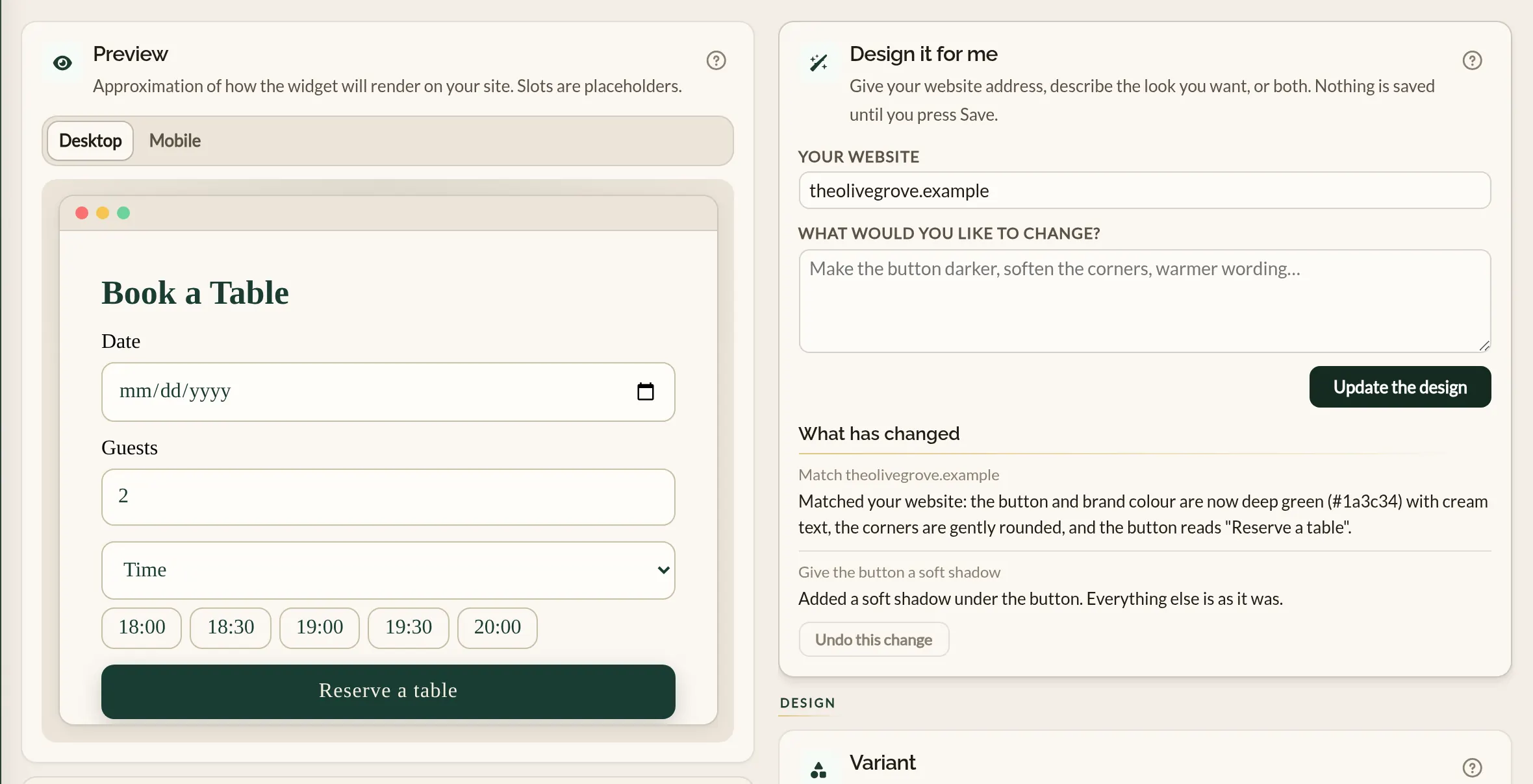
Once it has made a design, the description box becomes What would you like to change? Ask for an adjustment in plain words — "make the button darker", "softer corners", "warmer wording" — and click Update the design. It changes what you asked for and leaves the rest as it is, including anything you have edited by hand in between.
Each change is listed under What has changed, with a short note of what was done. If you do not like the latest one, click Undo this change to put things back as they were. Undo is there until you edit a control yourself.
What it changes and what it leaves alone
- It sets the brand colours and font, the corner rounding and spacing, the header, the button, the input colours on an inline widget, and the wording of the labels.
- Where the controls cannot produce the look — a shadow, a hover effect, letter spacing — it writes a little CSS into Advanced CSS for you (available under the Customise tab).
- It does not change the variant, the integration, your allowed domains, or where guests are sent after booking.
- It chooses from the same fonts as the Brand section, so expect a close match to your website rather than an exact copy.
Variant: button or inline
The first decision is what shape the widget takes on your page:
- Button — a single call-to-action that opens a Make a Rezzy booking page in a new tab when clicked, keeping your site open behind it. Compact, low-commitment, fits anywhere on a page. Best for headers, footers, or alongside other content.
- Inline — date, guests, and time inputs sitting directly on your page. The guest picks a slot, enters their details, and confirms the booking without ever leaving your site, with a confirmation shown right there on the page. If the booking needs a deposit, a secure Make a Rezzy payment page opens in a new tab to take it, so they keep their place on your site. Highest visibility and the shortest path to a confirmed table. Best for a dedicated bookings section or a homepage hero.
You can flip between the two at any time — the rest of your settings carry over. For the inline widget to confirm bookings on your own page, list your site under Allowed domains — see below.
Brand
Two colours plus a font, applied across the whole widget:
- Primary colour — your restaurant's main brand colour. Used for the booking button, focus rings, and highlights.
- Foreground on primary — the colour of any text that sits on top of the primary colour. White or near-white for dark primaries; black or near-black for pale primaries.
- Font family — System (uses whatever font your page already loads), Inter, Lato, Playfair Display, Roboto, or Montserrat. Keep it close to the font already on your site so the widget does not feel bolted on.
Layout
Two controls shape the widget's overall feel:
- Border radius — Sharp (square corners), Rounded (the default — gentle rounding), or Pill (fully rounded ends). Each has a custom-pixel override if you need a specific radius to match your site's buttons.
- Density — Compact, Comfortable, or Spacious. Controls vertical breathing room between fields. Compact for small placements, Spacious for hero sections. Custom pixels again available if you need a specific value.
Button settings (button variant only)
When the variant is set to Button, this section controls the call-to-action itself:
- Text — what the button says. Defaults to "Book a table". "Reserve a table", "Make a reservation", and "Book now" are also common — pick whatever matches the tone of your site.
- Background colour — the fill colour of the button. Often the same as your brand primary, but you can override it here if the button needs to pop against a specific page background.
- Text colour — the colour of the button's label. Usually matches your foreground-on-primary, but adjustable independently.
Inline form settings (inline variant only)
When the variant is set to Inline, this section appears with extra controls for the form inputs themselves:
- Input background, text colour, and border colour — three colours for the date, guests, and time fields. Match these to your site's input styling so the widget feels like part of the page.
- Stack inputs vertically on mobile — when ticked, the date, guests, and time inputs stack on top of each other on narrow screens. Best for placements squeezed into a narrow column. Leave unticked to keep them side-by-side at all sizes.
- Slot display — how the available times are shown. Dropdown only shows times in a single drop-down. Dropdown + quick-pick buttons shows the earliest few slots as chip buttons alongside the drop-down, letting guests jump to the next free time in one tap.
- Quick-pick count — how many chip buttons to show. Anywhere from 1 to 5. Only relevant when Slot display is set to "Dropdown + quick-pick buttons" — the field is greyed out otherwise.
Header
The Header section adds an optional title above the widget. It shows for both the button and inline variants, sitting just above the booking button or the date and guests inputs. Leave the header text blank to hide it — the rest of the controls are greyed out until you add some text.
- Header text — the title guests read above the widget, such as "Book a table" or "Reserve your spot". Clear it to hide the header.
- Text colour — the colour of the title. Match it to your site's headings so the widget feels at home.
- Font size — the title size in pixels, anywhere from 8 to 96.
- Alignment — whether the title sits to the left, centre, or right of the widget.
- Weight — Normal or Bold.
The header uses the same font as the rest of the widget, set in the Brand section.
Labels and redirects
The text the guest reads on the widget, plus optional post-booking URLs:
- Date label, Guests label, Time label — the three field labels above the booking inputs. Defaults are "Date", "Guests", and "Time", but you can change them to anything ("When", "Party size", "What time" — whatever matches your tone).
- No-availability message — the line shown when no times are available for the date the guest picked. Default: "No times available — try another date." Useful for nudging guests towards a different night ("Fully booked — try Sunday lunch?") or pointing them at a phone number.
- Success URL — where to send the guest after they finish booking. For an inline booking completed on your own page, leave it blank to show a brief confirmation on the page, or set your own thank-you page to send them there instead. For button bookings, and when a deposit is paid, it is the page the guest lands on after the Make a Rezzy booking page.
- Cancel URL — where to send the guest if they back out of the booking flow on the Make a Rezzy page. Leave blank to use a Make a Rezzy fallback page; set to a page on your own site (your homepage, or the bookings page the widget sits on) to keep them with you.
Advanced CSS
For everything the structured controls do not cover, the Advanced CSS section accepts raw CSS that gets injected into the widget. This is a power-user feature — most operators will never touch it. Useful when:
- You need a specific shadow, gradient, or hover state that the built-in controls do not expose.
- Your designer has given you a stylesheet and you want to apply it verbatim.
- You need to tweak spacing or sizes for an unusual placement.
Targeting parts of the widget
Start every rule with [data-makearezzy-widget] so it
only affects the widget and not the rest of your page. Each part
of the widget then has its own name:
[data-mar-part="header"]— the title above the widget.[data-mar-part="button"]— the main button.[data-mar-part="label"]— the text beside each field.-
[data-mar-part="field"]— the date, guests and time inputs, and the guest details fields. [data-mar-part="quick-pick"]— the quick-pick time buttons.[data-mar-part="notice"]— the confirmation message.
[data-makearezzy-widget] [data-mar-part="button"] {
  box-shadow: 0 6px 18px rgba(0, 0, 0, 0.18) !important;
}

[data-makearezzy-widget] [data-mar-part="button"]:hover {
  filter: brightness(0.92) !important;
}
To change something the widget already sets — a colour, a border,
the rounding or the padding — add !important, as in
the example. Without it the widget's own styling wins.
CSS written by Design it for me
When Design it for me writes CSS, it keeps it between two marker lines:
/* design-assist:start */
...
/* design-assist:end */
Anything between the markers may be rewritten the next time you ask for a design. Put your own CSS above or below them and it will be left alone. It never writes CSS for something a control already sets, so the controls keep working after a design.
The integration adapter
The Integration section in the configurator lets you connect the widget to a partner system. Currently the only option is Spektrix, which reads the customer's basket from the host page and uses it to pre-fill the booking. See Spektrix integration overview for what that does and when to use it.
Leave the adapter as None for a standalone booking widget — that is the right choice for the vast majority of restaurants.
Allowed domains
For the inline widget to confirm a booking on your own page, Make a Rezzy needs to know which websites the widget is installed on. The Allowed domains section is where you list them.
This is a safety measure as well as a setting: only the websites you list can take a booking directly on the page, so a copy of your widget on a site that isn't yours can't send bookings into your diary.
-
Type the address of the site the widget runs on — for example
example.com— and click Add. - Add as many as you need — your main site, a separate events site, and so on — then save.
You only need the base address. Subdomains are covered
automatically, so adding example.com also allows
www.example.com and book.example.com.
Live sites must be served over https.
If a guest opens the widget on a site you have not listed, the booking still works — the widget opens a Make a Rezzy booking page in a new tab so they can finish there, keeping your site open behind it so they can pick up where they left off. The button widget works the same way.
Venues
If your business is part of a group on Make a Rezzy — a hotel with two restaurants, say — a Venues section appears in the configurator. Tick Offer every venue in the group and guests see a Venue dropdown in the widget, with this business selected first; the preview shows it straight away. Each booking lands in the diary of the venue the guest chose, with that venue's opening times, deposit rules and integrations.
Only venues that are live and take table bookings are listed. Leave the box unticked for a widget that books this business alone.
The live preview
The preview on the left of the configurator shows your widget exactly as a guest will see it on your site. Every change you make to the controls is reflected immediately — there is no "Preview" button. Use it to sanity-check colour combinations and spacing before saving. The times, and the venues in the Venue dropdown, are placeholders: the real widget shows your live availability and the group's live venues.
Saving your edits
A bar at the bottom of the page appears the moment you change anything. It has two buttons:
- Save — publishes your edits. The live widget on your website picks them up within a few seconds, with no need to re-paste the embed snippet.
- Discard — throws away every change since your last save, and reverts the configurator to the published version.
Where to go next
- Adding the widget to your site — the embed code and where to paste it.
- Adding the widget on popular platforms — paste-in steps for the most common site builders.
- Spektrix integration overview — what the Spektrix adapter does.
See also: The restaurant booking widget